[Previous entry: "Hear me roar!"] [Next entry: "Anti-consumerism experiment breaks down..."]
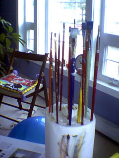
04/18/2004: "Brush holder tip!"
This may seem like a silly thing to have a post about, but last night I tried something kind of by accident that I ended up really liking. I had this jumbo roll of paper towels set up on one of the little tv-tray tables that I use for holding my pallets, etc. and rather than setting my brush down on the pallet (which leads to rolling around, getting color on the handles and sometimes falling onto the floor) I decided to just stick them into one end of the roll of paper towels. Anyway, I don't know why I didn't think of doing this sooner, it's awesome. Also, the paper towles are there for removing excess paint from your brush. I keep a little waste paper basket below for tossing used paper towel when it get's too juicy. Anyway, I don't know what y'all do with your brushes, but I've found a method that works incredibly well for me.
Also, I worked last night on one of the paintings I accidentally destroyed a couple of weekends ago. I made some rather dramatic changes to the colors and now I'm not sure if I like it, or if it's too much. Below are two versions with relatively the same color combo, one more simplified than the other...Thoughts anyone? (by the way, these photos were taken with the little low res Blink II so I realize there not the greatest)


Image A or Image B