Alaskan Artist - Elise Tomlinson
Home Artist Blog About Me Life in Alaska Purchase Site Index Speak
Home » Archives » August 2004 » New painting

[Previous entry: "man I love to paint!"] [Next entry: "Painting Croppage"]

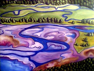
08/30/2004: "New painting"


It's just a start, I'm afraid the water portion of the tidal flat is too stylized, that it's not coming across as a tidal flat. What do you think? (Sorry the photo isn't that great, the blink is back).

tide1 (40k image)


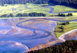
Below is the photo I worked from...one I took from a small airplane and then doctored in PhotoShop.

tide1-photo (40k image)


Replies: 8 Comments

on Monday, August 30th, Howard said

Looks good.

It might be the dramatic colour change from the more natural coloured trees and grass to the violet tones that's causing your problems. That's not a bad thing in itself. It might just take a bit of work to get it all to fit together.
I like the abstracted landscape. The trees remind me a bit of this artist http://www.rosspenhall.com/art.html His work is very different, but at the same time somewhat similar.
Post more pics as you work o it!

on Monday, August 30th, Elise said

I agree that has been an issue. There are times I look at it and I love it but other times I feel like there's something I'm not getting right.

As for the artist that you posted the link to, YUMMY! I *love* his stuff.

My favorite thing about this painting I'm working on is the very stylized trees. The shadows reminded me a little of De Chirico.

Anyway, I'll keep painting and posting. That's why I get stressed when I'm under a deadline. Sometimes these things take time.

on Monday, August 30th, Anna L. Conti said

Whoa! Cool! I like your new direction... no, the water doesn't "natural", but so what? Ever try glazing? A very thin layer of translucent pale blue might look good over that water.

on Tuesday, August 31st, RR said

It's looking great. I love the colours and wonder if maybe the darker rusty colours on the left are making the water stand out more, making it look less tidal flat. Would painting it paler make a difference?

on Tuesday, August 31st, Elise said

Thanks Anna, I've been experimenting more with glazing...it's amazing that up until a year ago I never paid attention to the transparency ratings of the oils I used!

I hadn't thought of doing a glaze over the water but it's a great idea to try.

And RR, I can see what you mean, in the photo, the spots of rust (seaweed actually) to the left are much smaller. Perhaps de-emphasizing that will help as well.

Thanks again all for your suggestions (and those of you who emailed as well!)

on Wednesday, September 1st, Dio said

I 'll throw my tupence worth in as well. I'm having difficulty with the space of the piece, it all feels flat, which is in part is to do with the perspective of the original shot.

If the aim is to still retain the elements of landscape in the abstracted piece, without it becoming fully stylized, then I think one of the things you could look at is giving the piece more depth, as in depth into the picture plane. That would have the effect of giving the landscape a feel of receeding and give the tidal plain more of a tie in with the rest of the surrounding landscape.

I think you could look at the outlining, it seems to be off a very similar size, which is great for stylization, but not so good for maintaining a feeling of space and the figurative element of the landscape. The outlines at the bottom of the picture are the same as the top, which flattens the space.

I also feel the row of trees at the top kills the space. They are very similar tonally to the row of trees above the tidal flat, in effect bringing them forward in the piece and detracting from the overall disappearing nature of the space in the picture, which in turn affects the way the tidal plain is read.

Of course though, they are just my prejuidiced opinions - feel free to ignore!

:)

on Wednesday, September 1st, Elise said

grrrr...thanks Dio for the comments but it's just too depressing. I'm not sure I can make all those changes at this point a lot of the texture is already in place so unless I start over totally from scratch, I can't get rid of the line of trees, for example.

Do you feel that the photograph looks flat or just the painting? I mean, I doctored the color in the photograph but nothing else, that's actually how it looked from the air.

Anyway, you've given me some things to think about. Thanks for showing an interest.

on Wednesday, September 1st, Dio said

Sorry Elise, I didn't mean to depress you - they are just my own feelings for the things that make me tick.

You are always as ever free to completely disregard my comments!

There is a certain flatness to the photograph, but that's the angle. Where its strong is in the shadows of the trees. You can sense a mist over the top left corner, that kind of gives it that depth as the trees seem to fade into it.

If the aim is to be more stylised, then my comments are irrelevent. But I sense you don't want it to look too stylized? :)

If you mask of the top row of trees just with your hand, the picture comes alive more - there is a lot more noticable space in it - but with both rows of trees at the same intensity, it makes the picture look flatter - maybe its a case of glazing the top row slightly lighter? I will leave that up to you though. :)

I don't want to sound like I'm telling Grandma to suck eggs! ;)