Alaskan Artist - Elise Tomlinson
Home Artist Blog About Me Life in Alaska Purchase Site Index Speak
Home » Archives » September 2004 » Painting Croppage

[Previous entry: "New painting"] [Next entry: "Who's Stlye is it Anyway?"]

09/01/2004: "Painting Croppage"


tide2 (36k image)

tide3 (33k image)


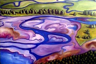
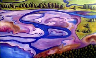
Dio has made some comments about the painting below feeling flat and had a problem with the upper row of trees not being very differenciated from the middle ones. Here I have cropped the image into two potential new configurations. Do you think either make the composition stronger?


Replies: 6 Comments

on Wednesday, September 1st, Markus Barca said

I like the top one the best. Picture two has an overt edited look to it. Well, that's my two-cents anyway.

I should make more of an effort when it comes to learning about art. I use the old worn out "I knows what I likes, and I likes this" line far too often when people ask my opinion on such work.

Curious though. Does your work fall into any sort of style that I might be able to research into?

on Wednesday, September 1st, Elise said

"I knows what I likes" is the answer I give too! Studying art may allow you to appreciate something on a different level, knowing its historical context, but in the end it's all about having a personal response (as far as I'm concerned.)

As far as my style goes, I'm not really sure what it would fall under. This particular painting is something very different from what you'd see in any of my other galleries. Here is a link to my last show titled Rain Country which is more typical for me.

I've never really thought of it. I guess I'll ask some of the other artists who read my blog. Good question.

on Thursday, September 2nd, Dio said

I'd veer towards the first one as well. What do you think Elise?

on Thursday, September 2nd, Elise said

Of these two, I like the first one better than the second, but I'm not convinced that it is stronger than the original composition.

I have this thing about framing. I feel like the trees curving round from the top and bottom create a nice frame. Because I used my crap camera, part of the right side of the canvas isn't there, it looks more like the photo, with the trees wrapping until they almost touch (top and bottom).

The thing is, it's not unheard of to do several drafts of the same painting to see which ones looks better. Maybe both will look good. I'll have to start a new painting anyway. What I think I'll do first is try the glazing and possibly working on the scale or contrast of the trees in the foregrond vs. the background. If those work I may not have to start over.

The actual painting is 24"x34" which is a pretty big canvas and it actually looks much better than that thumbnail photo. I really do need to get a better camera. Oh money, why do you taunt me?

on Thursday, September 2nd, Howard said

yep, nothing wrong with doing more than one. Personaly I think this is all just part of working with the image. I'm not sure if I think one is any better than the other. Just work on them and see where it all goes.

on Wednesday, September 8th, Chay said

For me, the watershed in transition comes alive (is more meaningful) in the top image, which I prefer over the bottom image and the original uncropped painting with trees at the top.

The river makes this image meaningful, so I think don't cut it. The trees at the top of the frame in the original are, to me, a bit of a distraction.

Here's sending you good energy.