Alaskan Artist - Elise Tomlinson
Home Artist Blog About Me Life in Alaska Purchase Site Index Speak
Home » Archives » February 2005 » To berry or not to berry...

[Previous entry: "Cat and Dog Show"] [Next entry: "Last entry (I promise) on the raven cat painting"]

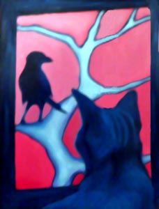
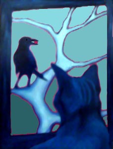
02/28/2005: "To berry or not to berry..."


OK, now I'm considering changing the background color so I can add a bright red berry to the raven's mouth. Better or worse? (I realize this enters the realm of personal asthetics but...)

OR

I could keep the pink background, add the berry but make it a different color so it stands out from the pink.

raven-cat3 (22k image) raven-cat4 (22k image)

Replies: 9 Comments

on Monday, February 28th, Dio said

I have to admit I like the bluer background image, but as well as the major colour shift, I especially like the faint pink outline left behind - it adds to the mood of the picture.

The second one (blue background) focuses you more on the composition to my mind, the pink background is fairly powerful, and I feel it maybe ovepowers the composition, my eyes are attracted to the lower left corner rather than the striking image as a whole.

But that's my pesornal aesthetics at work there - as well you know ;)

on Monday, February 28th, Elise said

I think you're right about the color being the main focus of the pink version, whereas the cat and raven become more focal points with the color subdued.

Also, the color in the second piece is a better reflection of the Southeast Alaskan pallet. Not that this is in any way realism, but...I think the blue has a more calming vibe.

I really appreciate the comments Dio, and especially that you like the pink ghosting around the images. That is a result of PhotoShops Paintbucket feature, but now that I think about it, I think having it there does add a little something.

Muchas gracias!

on Monday, February 28th, holly said

What Dio said about the pink being powerful, and what you said about the calming influence of the blue. The dorky art historian looks at the pink background and reads it as a bloody sky, symbolizing imminent carnage as cat eats bird!!! The blue is more open to interpretation and narrative. Will the cat eat the bird? Does the cat want the berry? Is there irony involved with the fact that the prey has food, but the predator does not? Only half kidding- I can't help doing this with paintings.

My vote for the blue and the berry (with nice pink outlines!)

on Monday, February 28th, Being@gmail.com">SB said

See what happens with the window bar gone! Before, there was no question of the cat getting the raven.
This comment has no artistic value I know. As if a cat could catch a raven in a tree!!

on Monday, February 28th, Elise said

I don't think I've ever enjoyed commentary on one of my paintings as much as this. LOL

I think I'll title it "Red is the Color of Desire".

Well, that or "Nah Nah Nah Nah Nah"

on Tuesday, March 1st, Jim L said

The blue background has that Thiebaud thing going on in the pink outlines which is kinda cool. I love the intense stare that you know the cat is giving the raven, but you can't see the stare, it is only dramatically suggested. The berry is a nice touch, it gives the raven a deeper role in the picture - before he was functioning mainly as an object to the cat's stare. With the berry, he is more integrated into doing what ravens do - which isn't only taunting cats!

on Tuesday, March 1st, Elise said

Thanks Jim, it's funny because your comment reminded me of art history class and talking about the "male gaze", which in this case translates to the "feline gaze".

Since the raven is given the berry, he becomes empowered, and no longer just an object of feline blood lust.
:D

BTW, I did that actual painting last night to change the color from pink to blue and it was a bigger pain than I'd anticipated. the pink wasn't dry, had to be wiped off repeatedly and then the blue was changing color due to lingering pink, I kept having to repaint and repaint, but finally I got it to look like the sample above. Now if it will just dry by tomorrow so I can take it to KTOO by their deadline.

on Tuesday, March 1st, RR said

I love these. The red background definitely has a more "gothic" feel to it but I kind of like that. I'm into 'series' of things so I'd keep both and add another one in a different colour - but that's just me :rolleyes:

on Wednesday, March 2nd, Elise said

Doing a series is a great idea RR, unfortunately the painting was due at the gallery today, I've already made arrangements to deliver it a day late but that is just enough time to actually finish a single painting. Maybe I'll return to the topic to work in a series at some future date though.