Alaskan Artist - Elise Tomlinson
Home Artist Blog About Me Life in Alaska Purchase Site Index Speak
Home » Archives » May 2004 » A painting that's been kicking my ass...

[Previous entry: "Putting on your first Exhibit"] [Next entry: "OIL SHOCK/updated sandy beach painting."]

05/28/2004: "A painting that's been kicking my ass..."


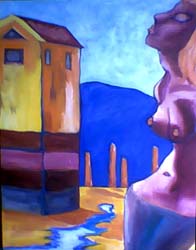
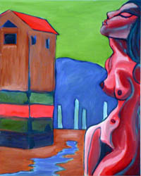
I worked on the painting Sandy Beach again last night, this is a painting I've taken off the wall and put on the easle about 35 times without painting on it. I just couldn't think what I didn't like about it, what to change, or how to rework it. I almost chucked it I was getting so pissed off and finally decided to just do something and I could always still chuck it later if I wanted to.

I think I like it better now than before, I'm not sure. It's lost the ominous quality that Dio liked, also I've used a lot of cadmium orange (I had to break down and buy some) but I haven't used any in any of my other canvases. Also, it's not as abstract as it was before, which is what some of you liked about it. It's just it was so much more abstract than the others that it looked ok on it's own but looked a little out of place with the others. I know we should judge each piece on its own merits, but when I'm working in a series I just have habits and weirdnesses about how things should look together...unless they are going to be on a totally different theme, for example, my tide paintings which don't have figures in them at all. I'd be thankful for any feedback. The new version is on the left. Unfortunately, the colors came through on the photo looking a little muddy (DAMN YOU BLINK) but it still gives you an idea. I do plan on fixing the face after it dries, adding in some more highlights and cleaning up the color overall. Anyway, honesty is the best policy.

sandy-beach (25k image) sandy-beach (25k image)


Replies: 6 Comments

on Friday, May 28th, Howard said

I really like the changes you've done so far. I like that there's more detail and the change in the colour of the sky. I'm not too sure about the colour on the figure though. To my eye it seems too close to the colour of the moutians and the sky making it want to recede into the background. Over all I like where you are going with it.

on Friday, May 28th, support@elisetomlinson.com">Elise said

Thanks Howard, what would your suggestion be for making the figure pop more out front? Do you think the color of the original (brighter) would do it? Or rethink it altogether?

on Friday, May 28th, elderberrystudio2000@yahoo.com">Jackie said

Hmmm...I'm thinking I really liked the nude in the old version better. And I also preferred the sky green, for some reason...I think the use of color is what makes the painting stand out. Sorry -
:(

on Friday, May 28th, support@elisetomlinson.com">Elise said

When pieces are still in progress, I really want to hear people's *honest* opinions...otherwise it does me no good at all. Ultimately I have to go with my own vision of things, but hearing what other people think is/isn't working is very valuable to me. Thanks a lot both of you!

on Friday, May 28th, Howard said

I'm not too sure what colour to suggest. Red might be a way to go. You could always do a cut and paste in photoshop to get an idea of what it'll look like first.

on Friday, May 28th, support@uas.alaska.edu">Elise said

Great suggestion!