Alaskan Artist - Elise Tomlinson
Home Artist Blog About Me Life in Alaska Purchase Site Index Speak
Home » Archives » May 2004 » OIL SHOCK/updated sandy beach painting.

[Previous entry: "A painting that's been kicking my ass..."] [Next entry: "Juneau rates high in a national quality of life study!"]

05/28/2004: "OIL SHOCK/updated sandy beach painting."


My house is oil heated and even though it's summer, my cost of heating has just doubled! I got my oil bill in the mail this afternoon, $575.00! And I have a small house that has a 5 star energy rating. If these prices keep up, I'll have to revert to having the furnace turned off while wearing lots and lots of layers.

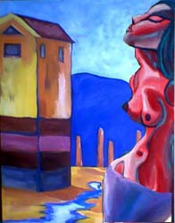
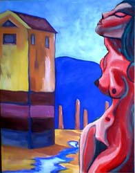
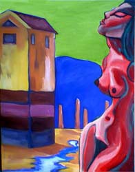
I took Howards advice and updated this painting in photoshop...now which one? (I added the one with the green sky because Jackie said she prefered the green sky...I'm not sure, I think I still prefer the middle one).


sandy-beach4 (27k image) sandy-beach5 (27k image) sandy-beach6 (26k image)


Replies: 8 Comments

on Friday, May 28th, Dio said

It looks nice and solid now - and its still very appealing to me - and still has a mysterious air...

However, the full figure is the one I prefer, covering her bottom half up kills the balance of the pictur IMO. :)

on Friday, May 28th, Howard said

Yeah I agree, the full nude looks better. The red looks better than I thought it would. You just got to love computers.

on Friday, May 28th, support@uas.alaska.edu">Elise said

Thanks guys, you're the best, really...it's so nice having people to bounce ideas off of...very cool.

And I agree about the joys of PhotoShop, it has totally changed the way that I work.

on Friday, May 28th, Howard said

Still like the middle one. The Orange in the building pops nicely with the blue sky and moutians.

on Friday, May 28th, stacy@gcsak.com">Stacy said

I agree with Jackie. The green complements the red figure, and brings her forwards more. It also changes the mood of the setting a bit too.

Not sure if this is good advice or not, but like I said awhile ago, the fact that I recognize the place was a little distracting for me which has now been solved in that example.

on Saturday, May 29th, Kadamshack@yahoo.com">karen said

Elise,
I feel the green flattens the background.....you loose the lovely depth you created in the middle one, which in turn draws your eye to the figure.
Unless of corse your'e working for a more patterned flatness than the third I feel is successful. Hope it helps...love the freshnes of your style.
Karen

on Monday, May 31st, elderberrystudio2000@yahoo.com">Jackie said

E:Okay - seeing the three side-by-side tells me the middle version is better. I liked the green sky, but as Karen said, it flattens the background. In fact, your eye first looks to the green, then the figure. In figure painting, you want the focus to be on the main topic of the picuture. Although I do like the surreal quality the green sky lendss to the painting.

on Monday, May 31st, support@elisetomlinson.com">Elise said

It's too bad I can't keep the green *and* create depth that makes the figure central, I wonder if a lighter color of green would allow that?

Anyway, I'm going to work on fixing the figure and if there's time, I might play around with the sky some more. That's the great thing about painting, you can always slap on another coat if you want to try something new.

Thanks everyone for your excellent observations!