Alaskan Artist - Elise Tomlinson
Home Artist Blog About Me Life in Alaska Purchase Site Index Speak
Home » Archives » July 2005 » Serendipity and intentions in art.

[Previous entry: "Phonemasters"] [Next entry: "JUMP---Try this out! (plus...question about magnetic business cards)"]

07/14/2005: "Serendipity and intentions in art."


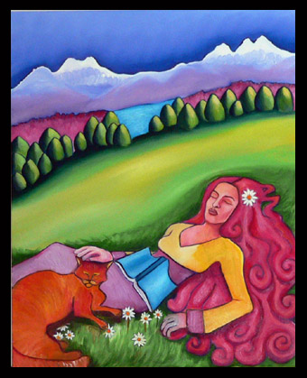
Well, i repainted her arm and the cat last night and I think the painting is working better now. Read Holly's comments about the placement of books in paintings, it's really interesting. It got me thinking about how many choices I make for completely random reasons that other people may read into (and rightly so) and how I always place more weight on a paintings composition (form and color) than on the narrative.

I don't have a thing for blonde hair for example (a friend pointed out that I have brown hair and yet I never paint women with brown hair and what that meant about my self-esteem etc.) but the truth is, I use mostly primary colors and yellow is one that I use alot in the lower parts of my canvases so I have to balance it out by adding yellow to the upper part of the canvas and sometimes the only place to do it is the hair, end of story.
My self esteem is in tact thank you very much.
;)


woman-book-cat (72k image)


Replies: 6 Comments

on Thursday, July 14th, subi said

and i thought you were painting me this whole time! :P idk, i would say you paint many hair colors, the women playing bluegrass all were brunettes! ;)

on Thursday, July 14th, Elise said

That's true, but I did that intentionally after said friend made the comments about never painting brunettes!

:cry:

on Thursday, July 14th, greg said

Gorgeous! I think the foreground works very well, and the cat is perfect. Now ... it may be the limits of digital viewing, or the amt. of newly added detail that seems to make the background wanting something (?) Perhaps simply some more textured brushstrokes on the mtn peaks that connect to the grassy texture?? ... or not!Whatcha think?:)

Speaking of strokes, I am bracing myself for Holly's next discussion on the iconography of kitty kats relating to this work! :laugh:

on Thursday, July 14th, Elise said

Hmm, not sure about that (texture) issue, this is a small photo so you can't see very well that there is some texture in the mountains and the fireweed (pink stuff near the glacier) has lots of texture, as does the glacier it'self.

The trees and hillside is smoother to set it off from the little mound of hillside the girl is resting in. That's how I see it anyway.

All I really plan to do with this one is put another coat of paint on the yellow of her blouse and her hands, and I think I'll call it good.

I may add a small amount of texture at the base of the trees, angling downhill...see how that looks. Otherwise, I feel pretty happy about this one.

A frustrating aspect of posting work online is that I can't control everyone's monitors. I'll post something that looks just like the painting on my home machine, then see it from my work machine and the colors will looked washed out or all orangish or something...oh well, it at least gives an idea.

Thanks for the suggestion.

on Thursday, July 14th, Joan said

I think this painting looks so much better than before. Honestly, I don't think it was ever one of my favorites but I couldn't really say why. Now, I feel peaceful looking at it. I think you took a leap in the right direction.

on Thursday, July 14th, holly said

Well Greg, I was going to let the placement of the cat and relation to the vulgar terminology of certain female parts derived from a diminutive term for cat just slide on by, but you just had to bring it up, didn't you? :plain:

:laugh: